OUR WORK

We Make the Complex Simple

From launching an employee program to creating a national ad campaign from the ground up, we have an unrivalled capability to cut to the chase. Our goal is to always go a little further to inform, inspire and engage your audience. Our work extends into almost every sector…

Client Logo

Ministry of Transportation
Information Management: Employee Engagement Campaign

Employee Engagement
Campaign

Challenge

The Ministry was launching an Information Management (IM) employee engagement campaign to help employees capture, manage, preserve, store and deliver information.

They had been using a 66-slide presentation deck — crammed edge-to-edge with text — to support their two-hour webinars.

Goals

  • To brand and market the IM training program
  • To transform existing IM practices with a theme and engaging design
  • To ensure employees understand IM practices—own them and activate them

Insight

We knew it was not enough to simply incorporate a new branding theme (e.g., cut & paste a new logo) into their existing presentation deck and other materials.

1
We did our Homework

We began by conducting a series of interviews with the Ministry — from business owners to divisional leads — to fully understand the IM training program and existing IM practices.

We also sat in on an hour-long webinar to understand better the employee experience.


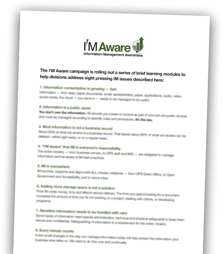
This information shaped our creative direction and was shared with the project team. As part of the branding exercise, we developed eight principles to steer the brand and to introduce the IM Aware campaign to executive.
i am aware
2
We developed a
brand that resonated

We drew up the synergies of IM (Information Management) and I’M (“I am”) to tie the brand with the desired client requirement — to ensure employees understand IM practices, own them and activate them.
i am aware
3
We gave their
deck a COMPLETE
makeover!
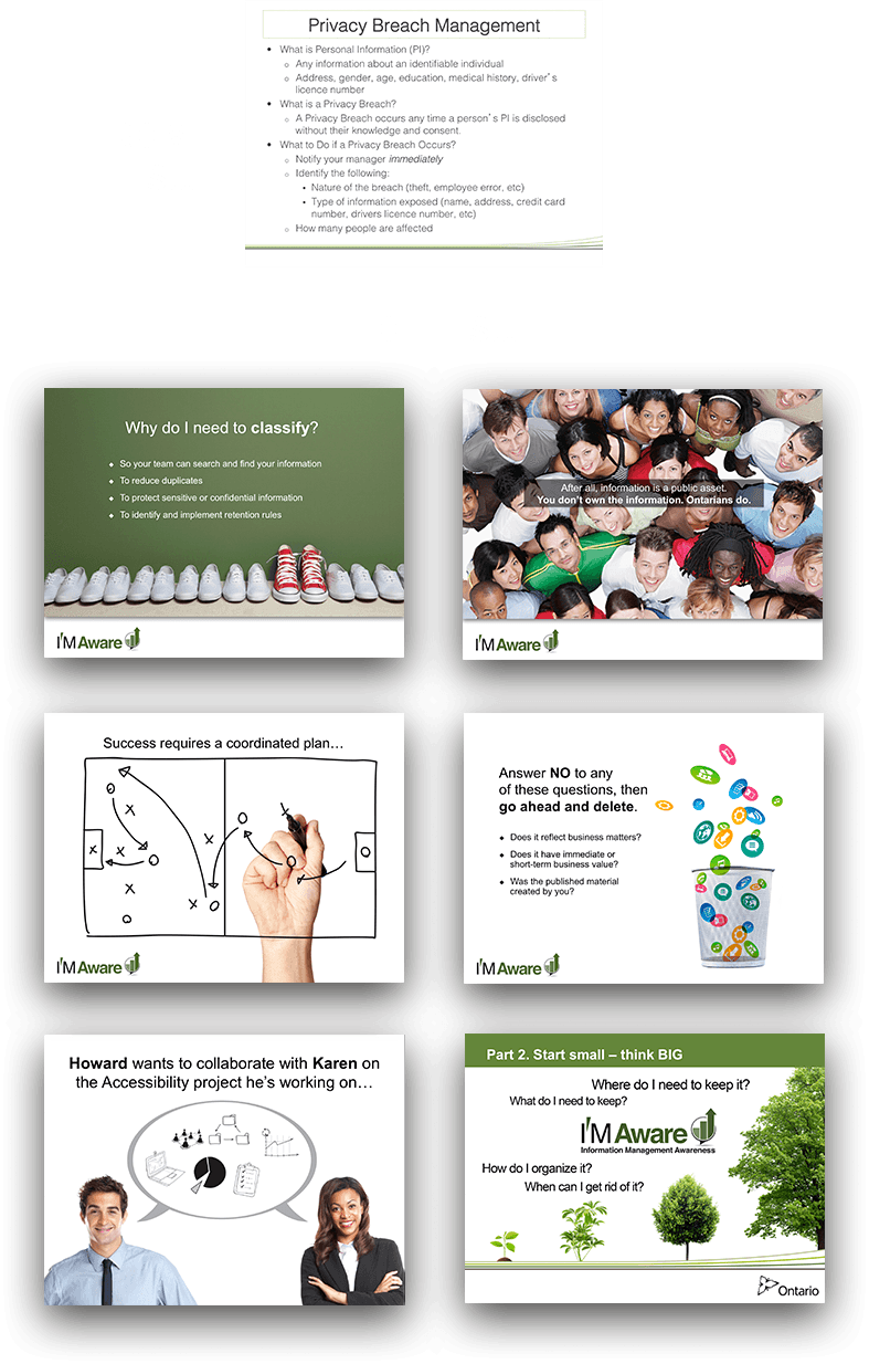
  • The existing 2-hour presentation was too long and text heavy and did not effectively market the services offered.
  • We rewrote, revamped and repositioned their training deck. The result was two brief, infinitely more vibrant decks — truncating the existing presentation to under 10 minutes for the general audience.
  • Heavier and more detail-filled content was repurposed into audience-targeted tip sheets available on their intranet page.
  • We changed the mode of delivery of the information so that each division could introduce the program to their staff as required.
i am aware
4
We applied I’M AWARE to other
in-house communications

We built IM Aware-branded templates in Microsoft Word for the content-rich quick reference sheets that the Ministry will populate in-house as required

We designed an eVite template to replace their text-only invitations currently in use.

i am aware

I very much like the material. I think it does the job very effectively.

Thank you. And congratulations.

I think you’ve really cracked a tough nut.

Stan Sutter,
Manager, Communications Branch, Ministry of Transportation

In-House Graphic Design Support

Professional Quality
In-house Support

Challenge

A large mortgage insurance company like Genworth is engaged in many initiatives and projects concurrently. They need ongoing creative support to maintain and forward their brand through consistent, high-quality materials for both internal and forward-facing audineces—all on a tight budget and tight timelines.

Goals

  • To provide consistently high-qualtity design support
  • To be so incredibly responsive, our services feel like we're actually in-house
  • To offer an enormously broad range of services: design for print and web, ad creation, writing, and photography

Insight

We know Genworth requires constently high-quality materials with fast turnaround. We continue to approach each project with the goal of superb customer service and top-drawer creative. We want every project to be perfect.

1
Ad Campaigns

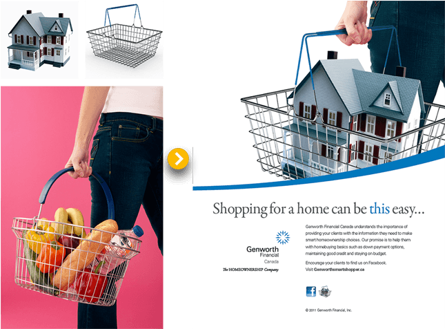
We virtually managed every facet of Genworth Canada's forward-facing advertising for print and web. We developed the look of their ads and, as required, we developed a series of ad concepts, year after year, that become their campaign for various offerings.

Here we developed the idea of making shopping for a home simple. We presented the concept, then created this first “Home Shopping” illustration in Photoshop melding three base images. We created this format for all ads and wrote the headline.

Shopping for a home can be this easy
2
Photoshop
Illustration

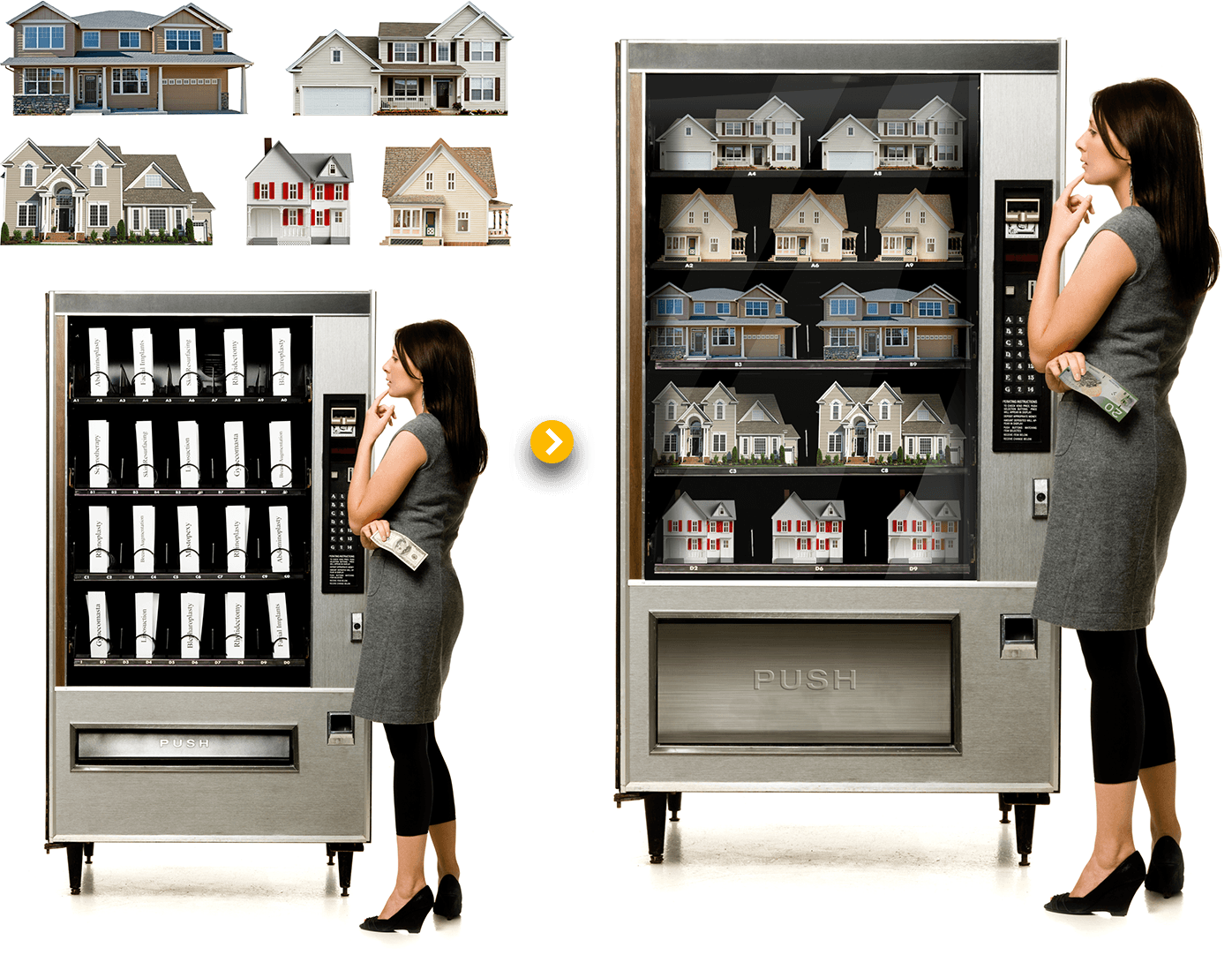
We are often called upon to create sophisticated retouches to illustrate ideas and situations. An illustration like this Home Vending Machine requires expert Photoshop manipulation to realize a convincing finished product. The use of shadows, and reflections to make the houses appear to be in the machine are key. So too is the creation of the enlarged delivery (right down to the fingerprints on the stainless) and the switch of currency to complete the illusion.

Shopping for a home can be this easy
3
Photography

For years, Genworth has invited us to shoot employees for all bios, social media, all imagery for annual reports, all company events, award ceremonies, and all media events. This level of trust and inclusion results in a comfort level with the staff and an opportunity to provide truly consistent coverage.

Photography

Thanks for setting up and being completely ready for us so you take less of our time to shoot. Not everybody notices, but I do and I appreciate it. Brian Hurley, Chairman and CEO

Ministry of Health and Long-Term Care
Health Care Funding Reform — Policy Launch Materials

Policy Launch Materials

Challenge

For decades, we’ve been involved in hundreds of initiatives with Ontario’s Ministry of Health and Long-Term Care. If you ask our clients, they’ll tell you we get these projects because they can count on us— day and night, weekends and holidays—to get the impossible accomplished. Ontario’s Action Plan for Health Care is a good example.

Goals

  • To add impact to the existing Action Plan logo
  • To design and print the Action Plan policy report
  • To do all this over a weekend!

Insight

It was within this project that we became intimately familiar with health care funding reform in Ontario — and subsequently became the Ministry’s most logical choice when explaining this complicated (and sometimes controversial) reform to Ontarians.

1
We helped unveil Ontario’s
Action Plan for Health Care

Deb Matthews, Minister of Health, was unveiling the province’s long awaited health care funding reform Tuesday morning.

We began the project on Friday night. Being absolutely familiar with Ministry brand standards allowed us to hit the ground running.

Our right-out-of-the-box reaction time to projects with this timeline means we were able to modify the logo, layout the content and provide the first proof by early Saturday morning.

Writing was modified continuously throughout the weekend, yet we provided final proofs Sunday night and printed and delivered by Monday evening—just in time for the policy’s unveiling Tuesday morning.

Ontario's Action Plan For Health Care
2
We’re experts in incorporating
numbers and data into presentations

If you look at most business presentations these days, you’ll likely find them overwhelming. While it’s important to include data in presentations, too much can kill it.

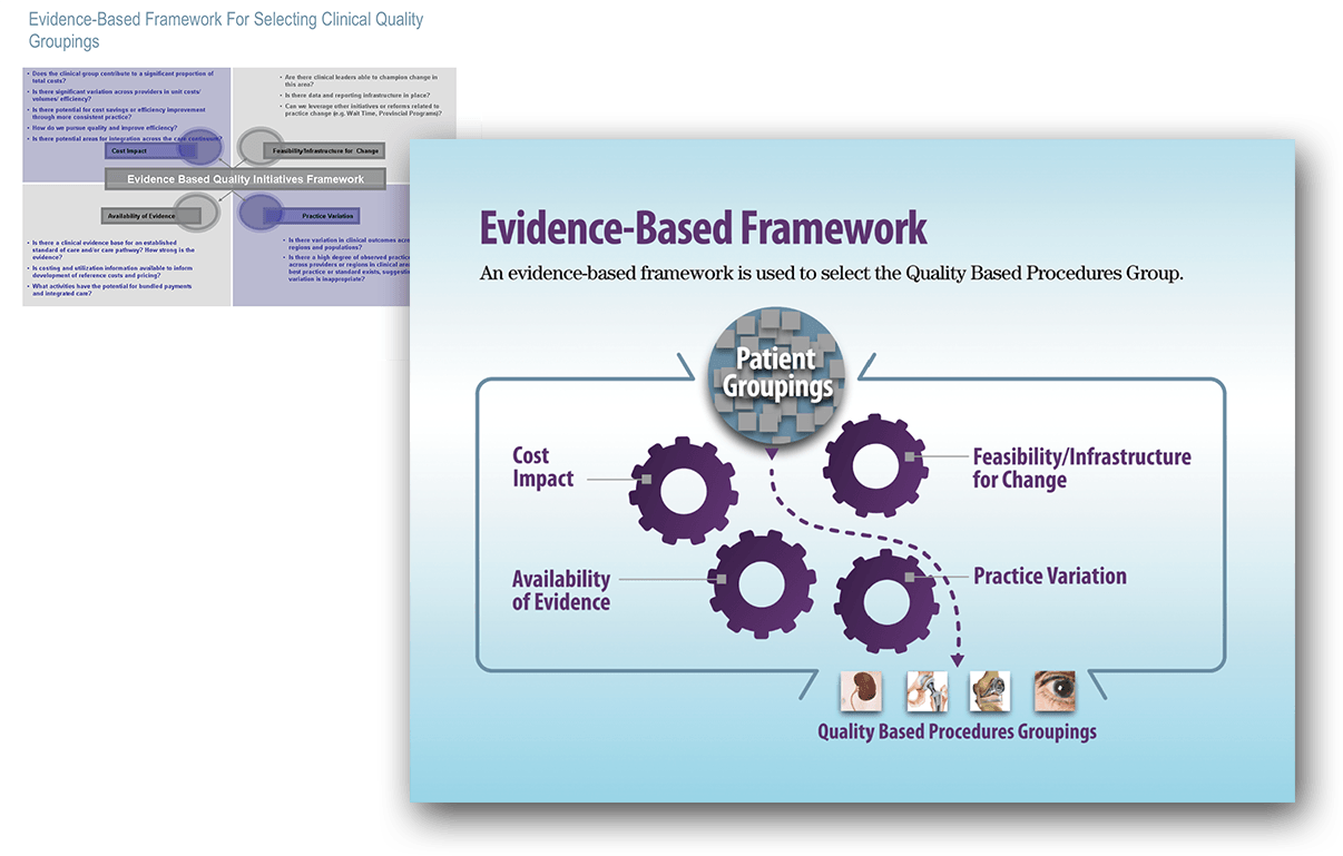
That’s why we were called upon to write and design a PowerPoint presentation to explain the Health System Funding Reform. Take this infographic as an example—it describes how an evidence-based framework was used to select the Quality Based Procedures groupings within the funding reform.

Evidence Base Frame work
3
We created a standalone
video in 2-languages

The deck became very popular very quickly, and so we were asked to create a video version of the presentation. We sourced voice talent for both French and English and generated the video in 4 days, again over a weekend!


Building Brand from the Ground Up

Building Brand from
the Ground Up

Challenge

In 2011, Helen Stevenson (former Executive Officer of the Ontario Public Drug Program) decided it was time to leave the public office and provide employers with a solution for a troubling trend – steadily rising drug costs in private drug plans. We had worked with Helen for years, and were now entrusted to build her company’s new brand.

Goals

  • To create a strong brand that is synonymous with employee engagement and benefit-plan sustainability
  • To launch the brand
  • To develop an integrated multi-channel strategy
  • To ensure the brand remains relevant to search engine queries

Insight

It was essential to develop a fully integrated and ongoing campaign to showcase Reformulary’s unique offer and:

  • Attract employers to subscribe to the Reformulary Inform, inspire and engage
  • members to protect their drug plan by making preferred drug-spend choices
1
We came up with the
PERFECT company name
Reformulary Logo set

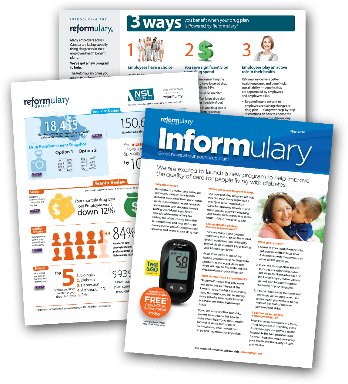
Our brand experts seized a great opportunity —the word "REFORM" is embedded right in the brand name. We combined Reform and Formulary—perfect.

  • One challenge is that no one knows what a formulary is.
  • All brand treatments needed to be clean, readable, and translate well to French
  • We came up with other killer sub-brands, like MyReformulary, Drugfinder and for the news bulletins, Informulary
2
We launched the
brand with a BANG!
Reformulary image

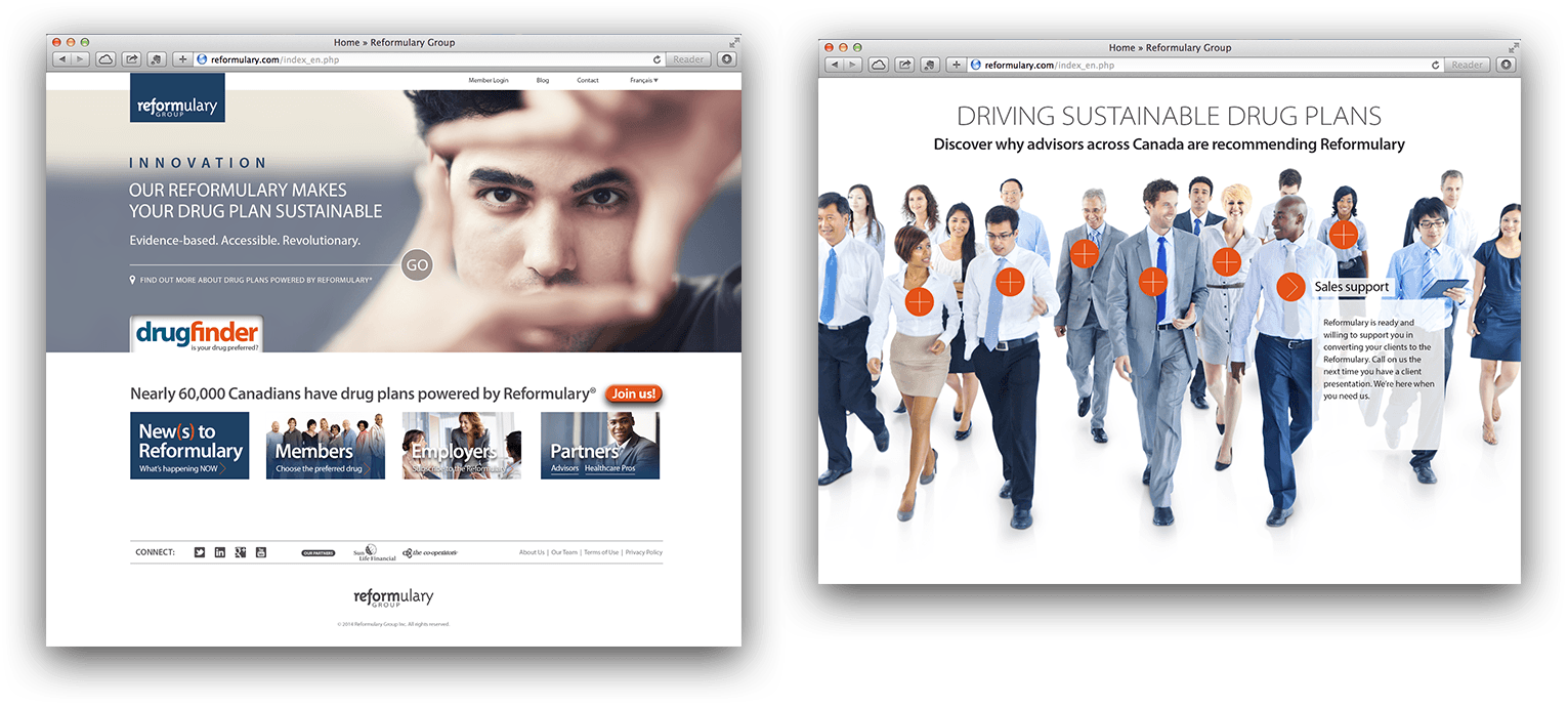
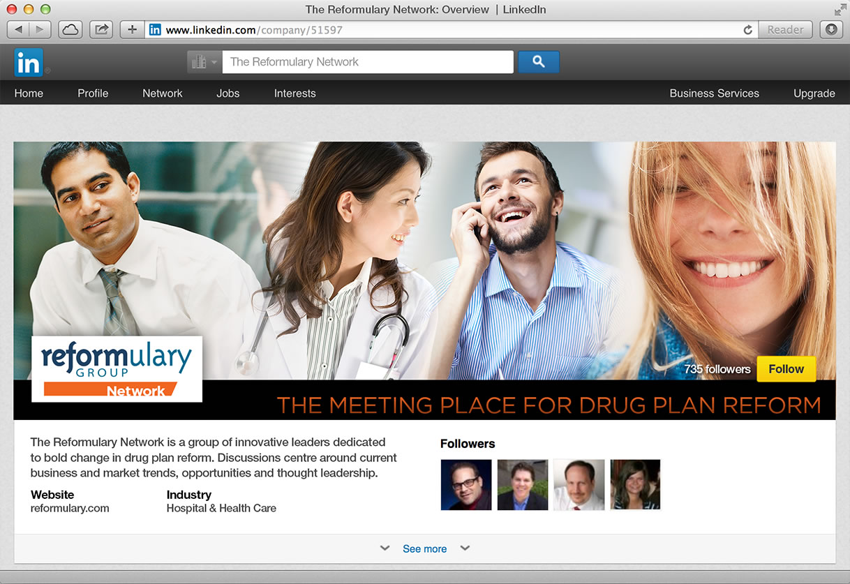
We always take a functional approach to website design and software development. We don’t just look at a site's appearance, but also its infrastructure, logic, usability, and ultimately, its effectiveness.

For the website and DrugFinder tool, we worked closely with software programming experts to provide a full range of services — from program and project management, to quality assurance, as well as front-end design and copywriting.

3
We make
change stick

To fully realize the benefits of Reformulary, employees really need to know what the strategy is, why it's important, and what they need to do to support the Reformulary on a daily basis.

We employed our "We Make the Complex Simple™" technique in a targeted communications campaign to employers, employees and pharmacy. Our goal is to deepen understanding and earn buy-in.

Reformulary image
4
We Put Content Marketing First

Our editorial team helps write, edit, design and distribute all of Reformulary's digital marketing assets — white papers, case studies, blog posts, information graphics, press releases, and data sheets.

We optimize content, messaging and positioning to engage target audiences meaningfully. Our search engine optimization approach ensures Reformulary's site is relevant to search engine queries and visible in search engine results. Done correctly — and consistently!

Reformulary image
 

News

What’s happening at Hope and Hoppen
@reformulary And of course a great group of women!
Mar 09, 2018 11:54am
@reformulary wow. That’s a nice bunch of photos!
Mar 09, 2018 11:17am
Check out Helen Stevenson's recent Opinion-Ed: How we buy drugs is affecting the costs https://t.co/NXUvah55Op via @torontostar
Dec 09, 2017 3:04pm
@freshbooks WHERE ARE YOU?? You've locked us out of @freshbooks. Told me my trial is up. But I'm a paid subscriber.… https://t.co/7dcWzwzUYz
Nov 23, 2017 12:58pm
Proud dance mom Lynne Hoppen shares how social media is changing the game in the dance world: https://t.co/UJV3NIG64N
Aug 17, 2017 4:40pm
In her latest LinkedIn post, Lynne Hoppen muses on how social media is changing the world of dance: https://t.co/y3gjcd8sYg
Aug 17, 2017 12:00am
Have you heard of Alexander Chung? Lynne Hoppen shares how the Edmonton native became a world famous choreographer:… https://t.co/wqqLvRQ4lf
Aug 14, 2017 9:00am
In the dance world, you need every edge you can get. Lynne Hoppen weighs in on how social media provides that edge:… https://t.co/1nuLpDYTuP
Aug 11, 2017 5:30pm

WHY WE’RE DIFFERENT

We’re family. We share a common vision and work as a cohesive, integrated team on ALL projects. Together, we’re relentless in the pursuit of deeper inspiration, clearer messaging, and the continuous hunt for better ways to inform, inspire and engage. Plus we have fun while we’re at it.
OUR PEOPLE

Our culture stands out during client brainstorm meetings, working late to finalize a report that must be on the Minister’s desk in the morning, or when someone steps in so that a team member can skip out to grab front row seats at their kids’ spring concert.

MICHAEL HOPE

CO-FOUNDER, CREATIVE DIRECTOR

Now: Creative ideation and direction, chief designer, award-winning photographer, IT support, family guy.

Then: Michael has been leading the creative development of brand and communications for over 25 years. He headed the design team in a print service bureau where he developed and managed creative programs in retail, internal and consumer marketing. Michael expressed his entrepreneurial efforts and creative vision in 2000 when he founded Hope Creative. Michael rolls differently than other creative types. His knowledge of vintage television is unmatched. He writes great ad copy. He’s an award-winning photographer and designer. His design degree is from Rhode Island School of Design. He’s designed at Apple in Cupertino. PLUS he holds the record for the fastest assembly of an IKEA PAX cabinet at just under 9 minutes.

LYNNE HOPPEN

CO-FOUNDER, EDITOR-IN-CHIEF

Now: Information synthesizer, content strategist, metrics-driven marketer, operations, business development.

Then: With over 20 years of entrepreneurial experience as Principal of The Hoppen Group, Lynne has contributed strategic and conceptual thinking — and clear meaningful words — for Fortune 500 companies, not-for-profit and government. Lynne has an uncanny, unrivalled ability to cut through a sea of information to provide the facts that people need to know. Her critical, creative thinking and lean writing style inspires people to notice, understand, care and respond. Lynne really knows how to “make the complex simple”. Perhaps too, one of her most honed skills is as a fridge whisperer, able to create yummy and nutritious school lunches for three kids using only a single chicken bone and a radish.

MONICA WALRAVEN

PROJECT MANAGER

Now: Layout artist, editor, SnapComms guru, office management.

Then: Monica and Lynne met first in 1990 as interns at a publishing company in Mississauga—since then they’ve been to each others weddings and shared tea almost daily for decades—so Monica IS family. Around our office, Monica is most known for her eye-for-detail. She’s responsible for agency-wide delivery of all projects and ensuring we produce our best work quickly, efficiently and on budget. With over 20 years of production experience, Monica has managed a ton of diverse and important projects for clientele like Scotiabank, CIBC, Genworth, Janssen Inc., AstraZeneca, and Rogers Communications, to name a few.

PAULA CASSIN

SNAPCOMMS N.A. SALES MANAGER

Now: SnapComms client support, solution-finder, employee engagement specialist.

Then: Poor Paula — her home base is the beautiful and tranquil Santa Barbara, California. Paula is one of those rare sales and service managers who also naturally serves as an inspiring mentor. With a strong background in IT, sales and marketing, Paula is our go-to person for SnapComms problem-solving and support. When we require her expertise to help a client, she eagerly steps in to provide exceptional sales and post-sales training support. Paula’s positive attitude and the respect others feel toward her are infectious. She’s the real deal and WE are the lucky ones to have her as part of the SnapComms Canada team.

WE LOOK FORWARD

TO HEARING FROM YOU

GENERAL EMAIL

hello@hopeandhoppen.com

TELEPHONE

416-926-1666

186 Jarvis Street
Toronto, ON M5B 2B7

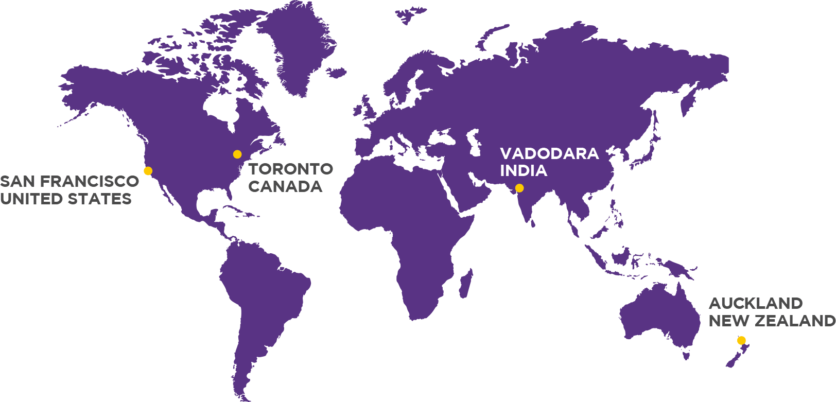
Our headquarters are in Toronto
with partners across the globe.